Breaking down the design and color – Reverse Engineering
Learn the aspects of an ad, breaking down contrast, repetition, alignment, proximity, and color. Simple yet effecting tools that make ads pop and get notice.
“Elvis Inspired Ads Call Back to Coke’s Legacy”
Coca Cola U.K. Launches ‘We Do’ Ad Campaign Ahead of Sugar Tax
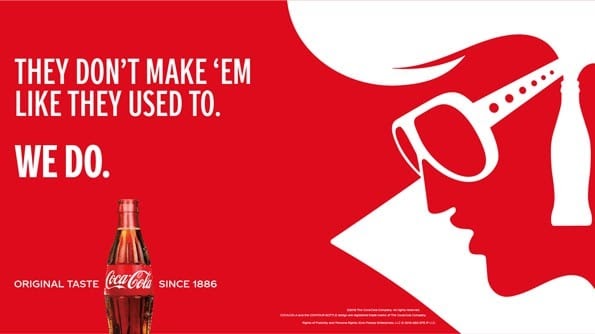
Coca Cola Great Britain has announced the launch of a new marketing campaign named, ‘We Do.’ The campaign is a celebration of Coca-Cola classic and comes just ahead of the U.K.’s sugar tax arriving next month, which will increase the cost of the soft drink.
Image Courtesy of Coca Cola UK
https://www.relevance.com/coca-cola-u-k-launches-we-do-ad-campaign-ahead-of-sugar-tax/
Contrast

Coloring is a bold contrast in this ad. The striking of red verses white pops off the page and really draws attention to the ad. The semi-optical illusion of the Elvis image makes the reader take a second look to focus on what the image truly is.
Repetition

Examples of repetition in this ad are the use of font: they used capitalized and bold fonts. They also repeated the colors red and white throughout. The only other color is the actual bottle showing the product itself.
Alignment

This ad chose a hard left alignment. The image is right aligned. The open space created a circular movement for your eyes to move from the words, to the bottle and logo, to the Elvis image, and back.
Proximity

The proximity used in this ad links the statements together, with a slight gap, making the reader take a small pause when reading it to add drama. The Logo is at the bottom to separate thoughts, and then there is fine print at the bottom right beneath Elvis, to not deter from the ad itself. There is a large space between the writing and the image so as to not seem too crowded, and to separate ideas.
Color

The colors in this ad are simple, yet bold. They are a hard contrast to each other and are mainly just red and white. A red background is very strong. The only other color used is in the bottle to show the product itself, in an understated logo at the bottom. They used the brand colors for Coca Cola – red and white.
Conclusion
I really liked reverse engineering this ad. It taught me a lot – both about not being afraid to be bold, but also that simplicity can be very effective. They are using nostalgia to remind the consumer of the old days, and the way products used to be made – built to last, with care and quality. Coca Cola uses the fact that they have stayed consistent as a selling point to show they have always been a quality product.
