Photography and Typography
Reverse Engineering
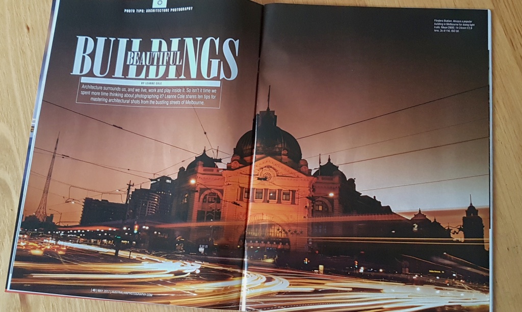
Photographer: Leanne Cole
Magazine: Australian Photography Magazine
https://leannecole.com.au/magazine-double-page-spread/
https://greatmagazines.com.au/magazine/APH
In the following images, I’ll be reverse engineering, or breaking down the aspects of the typography and photography used in this two page spread. I’ll also be mimicking the original photograph with my own photos to show similar rules in play.
Typography
Typography sets the personality of an image. It can be childish, frilly, bold and in your face, modern, or old fashioned. Font choice is important, and can add or detract from a piece. It can make an image stand out and get attention, or it can fade into the background.
Font
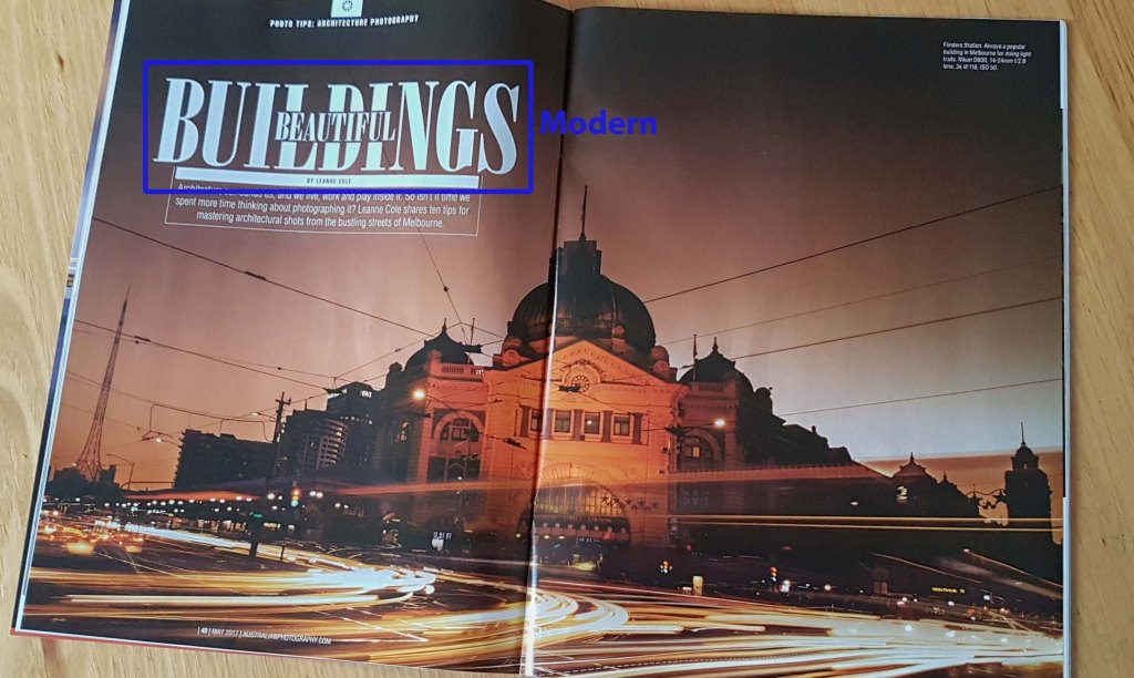
This layout uses Modern style font. This is identified by horizontal and very thin serifs, or lines, with no bracketing. There is a severe and radical thick/thin transition or contrast in the strokes, with a vertical stroke. There is no slant, the stress is perfectly vertical. This font tend to have a cold, elegant look.
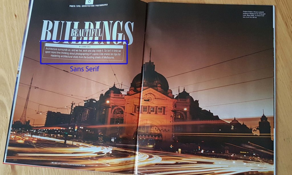
This piece also showcases the Sans Serif font. Sans Serif is identified by its being without serifs or stokes on the ends of the letters. The letters are “monoweight”, meaning no thick/thin transitions in the strokes, and no stress because there is no thick/thin. This makes the letterforms the same thickness all the way around.
Contrast
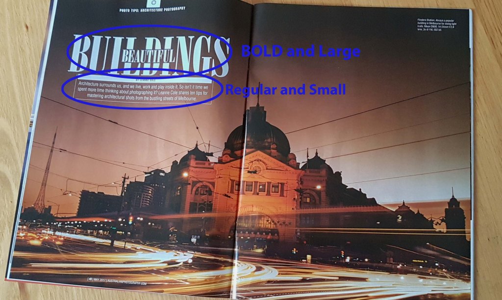
The contrast used in this layout is showcased in both the font choice and the font size. The title is BOLD and larger than the paragraph it precedes. Having a bolder title gets the viewer’s attention and draws them in.
Photography
Photography is a combination of following rules, but also not following rules. Following certain guidelines help enhance your images and give it a stronger impact. Mood, movement, viewpoint, vantage point, lines, balance, and placement are all key pieces in a good composition. The following are some guidelines to follow.
Rule of Thirds
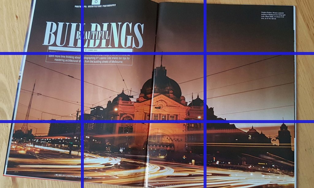
Using an actual or imagined grid over your image helps you to place your image in a balanced position. Place the image along a gridline, or points of intersection. This photo is placed along the bottom third of the image.
Lighting

The right lighting is essential in a good photograph. It changes the subject drastically however you choose to present it. The most favored time of day is the “Golden hour”, when the sun is lower in the sky, creating longer, softer shadows. It creates a soft, pleasant appearance. This photo was taken at dusk, creating a romantic mood. The lights of the cars from the extended exposure adds movement to the piece as well. The sun behind the building also makes a nice backlit effect.
Leading and Diagonal Lines
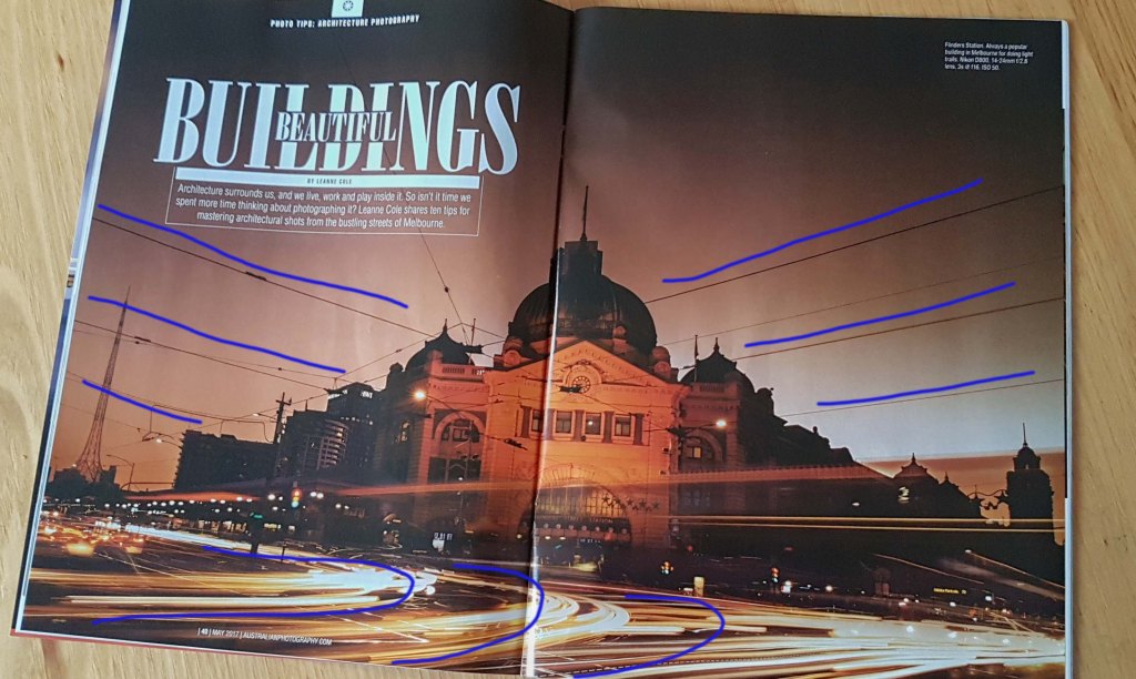
Lines draw our eye along it, and create movement. In this photo, the power lines lead the viewer to the center building. The extended exposure creates lines from the car lights which moves the viewer from the front to the edge of the photograph.
Symmetry

Using symmetry in your compositions creates balance to the photograph. This photo is perfectly centered, giving equal weight to both sides of the field.
Mimic Photography
Personal Images Using the Rules Used in Above Image
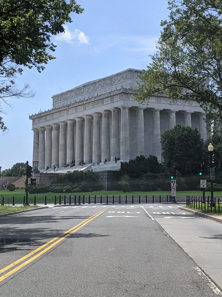
This photograph of the Lincoln Memorial uses the rules of symmetry, and leading lines. It is centered in the photo, and the street lines lead the eye to the building. This image could be substituted in the magazine spread because it is a strong image of a beautiful building, using many of the same rules.
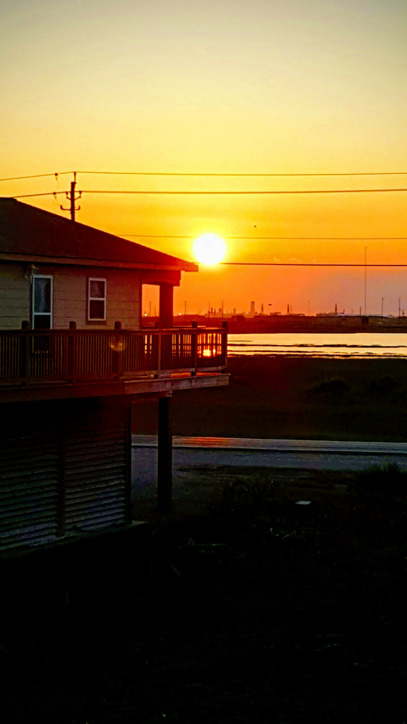
This photograph of a sunset shows lighting, creating a beautiful effect and romantic setting. There are lines from the power lines leading the eyes, and the building is adhering to the rule of thirds, sticking to the left third of the image. This image could be substituted in the magazine spread because it showcases how a basic building can become a beautiful building with a gorgeous sunset lighting it up in the background.
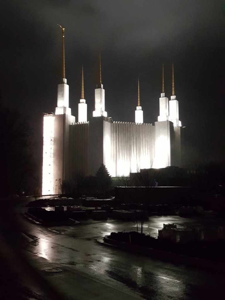
This photograph shows the lighting effect of dramatic lighting, with the darkness around the bright temple, there is a strong contrast. The steeples make leading lines leading upward, as does the street leading us to the temple. The photo is centered making it a symmetrical image. This image could be substituted in the magazine spread because it is another strong image of a beautiful building, also using many of the same rules.
Conclusion
Typography and photography are both “silent” ways to make a loud statement. They both set the tone, mood, or personality of what the author is trying to convey. Play with your fonts and rules to create the look you are going for. Rules are important guidelines, but are also made to be broken!

